Sunday, December 21, 2014

Synopsis for Crossroads 2014 on 'Art in Architecture' by Sujith.G.S


SYNOPSIS WRITTEN FOR CROSSROADS 2014

'ART IN ARCHITECTURE'
 by Sujith.G.S

CROSSROADS is an initiative by the architectural fraternity of Calicut to create a platform for some genuine architectural deliberations, critical thinking and ideation in the field of architecture and urbanism. The conference, in its first edition addressed the dynamics of the public realm through its theme of ‘Public Architecture‘. It was an attempt to revive the importance of public architecture in establishing the social and cultural equity, by actively involving & participating in building the public realm. The event featured talks by keynote speakers, a walk through the historic core of the city, workshops, exhibitions of public projects, competitions and various other activities, which created a platform for some great interaction and some critical architectural discussions.

The theme of the event this year is ‘Art in Architecture’, where we want to address the relevance and necessity of Art in Architecture. Although entwined in a symbiotic relationship, we find that there exists a dichotomy in the way art and architecture is integrated in our spaces today, with the end result being the highly chaotic interventions in our cultural landscapes.  Our cities and built spaces are filled with numerous examples of arguably irrelevant junk which masquerade as art. Further, the duality of design as a functional response to a programmatic requirement and also to notions / questions on higher metaphors needs to be explored in today’s context. No approach is absolute, yet, we find our spaces increasingly being defined by faux notions & symbols of artistic concepts. There are critical questions that we must ask – how deep is the role of art in architecture? How does art reflect and enhance our cultural construct? How can art inspire architecture in the exposition of a positive spatial and social agenda?

The subcontinent provides some excellent examples of integrating the regional craft traditions into the built environments. Presently, these craft traditions are being eschewed in favour of a globalised vocabulary, borrowing heavily from international imagery and graphical creations, without having the conceptual depth to contextualize the designs and to make it more relevant to the regional context. The pertinent question that we need to ask is if at all it is necessary to incorporate these micro-narratives into our spatiality, and if so, what are the social, economical and psychological implications?

Questions on the relevance of new media and digital templates in the architectural discourse need to be further addressed. How do we embrace this explosion of content and arrive at relevant themes? Today, the evolution of architecture is taken forward by newer economical realities and technological innovations. The tools of the trade are becoming increasingly digitized and the traditions of using the hand are being neglected and the cognitive process of design is being redefined. The directness of the hand drawn sketch in evolving and distilling ideas in the design process is being overlooked in favour of other digital media. Is this a positive evolution or is there a need for moderation?


Considering these multiple levels of enquiries, ‘Art in Architecture’ can evolve multi-directional approaches and positions which can help articulate a meaningful and relevant social perspective. Consequently, at this juncture, we feel it would be appropriate to address these new realities, to start a dialogue, to contemplate and to postulate, so that there is a much better understanding and appreciation of this critical agenda.

Tuesday, October 14, 2014

Golden Jubilee celebrations of Department of Architecture, College of Engineering, Trivandrum


A couple of awesome talks by Ar.Benninger and Ar.Peter Rich!!  Benninger took us through his works, right from one of his first projects to the recent IIT project that he is doing, explaining his thought process and inspirations. He impressed upon us the need to develop our own architectural language and explained about the evolution of such a language through the chronology of his projects.

Peter Rich's presentation was filled with slides of his drawings and hand renderings, which were truly amazing. What was truly inspiring was that during Benninger's talk, Peter Rich was intently scribbling notes and sketches in his sketchbook, constantly keeping on learning even at this age. One of Peter Rich's strong advice to young architects were to travel across the length and breadth of India and study the vernacular and traditional architecture which the country had to offer. He was of the opinion that this would be the best form of learning for any young architect, learning from history and re-interpreting it in your designs. He further called for architects to become more of activists, standing up and raising their voice for causes that they believed in. All in all, it was a really inspiring talk.


Friday, October 3, 2014

Helipads on top of High rises in India - is there a rationale?

I was reading through the article regarding the Los Angeles' Mayor's announcement saying that for new buildings it wasn't mandatory to have helipads on top as per fire rescue guidelines, as they limit the city's skyline to flat topped boxes and wondered about the relevance of this rule in an Indian context. The intention behind the Mayor's move was to have a more interesting skyline for Los Angeles, giving architects the freedom to go beyond flat-tops.

Image courtesy  - www.dailynews.com

los-angeles-no-longer-requires-helipads-on-buildings-allowing-for-bolder-skyscraper-designs


The logic behind this particular guideline, which is mandatory as per the National Building Code for buildings above 60m in height, is to have an escape mechanism for helicopter evacuation in case of fires in high-rise buildings. Although altruistic in intention, the practicality of landing a helicopter on top of a burning building needs to be analysed, with several experts felling that this is extremely dangerous. What is interesting is that Los Angeles was one of the few remaining cities in the US were this rule existed. Alternate mechanisms like separate elevators for firefighters, additional staircases etc. could be more effective and practical. 

In an Indian context, as was seen during the recent fire in Mumbai, helicopter evacuation was sought as a last resort to evacuate the trapped firemen. There also, the helicopter did not touch down on top of the building but only lowered the Navy sailor to rescue the trapped firemen. This does lead to question whether such a tactic can be employed instead of having a full fledged helipad on top. There have been plenty of instances where the DGCA has refused permission to land a helicopter on top of these helipads citing safety concerns. If the helipads are seen unsafe by the aviation authorities then why bother having them in the first place?

Image courtesy - www.indiatimes.com

More than any aesthetic consideration, one needs to wonder whether spending such a lot of extra money for the structural design and reinforcement required for erecting a helipad on top of a high-rise building is worth the expenditure if it is not going to be of much practical value. This is especially relevant in high-rise residential developments where this cost accrued to the builder is directly transferred to the resident. We need rules and regulations which work, which are practical and which takes into consideration all the stakeholders and not merely rules which exist on paper for a feel good factor. We must also understand that the value of a life is paramount and should not be compromised at all. It is high time that we rationalize the regulations and take into confidence the building community so that they do not cut corners and come up with inventive solutions to work around ineffective rules. It is thus critical that we revisit these regulations and reframe rules which are really effective and relevant in today’s context. Parallelly, we need to strengthen and better equip our fire services to deal effectively with emergencies in high-rises. The Los Angeles announcement has come at just the right time for us to introspect on our situation and address the existing concerns.

Laurie Baker Centre for Habitat Studies

Tha magic of Baker still lingers on. Had been to the Laurie Baker Centre for Habitat Studies in Trivandrum. I feel it is one of his least visited designs as it is slightly away from the city. But the simple beauty of his designs are still so inspiring. Scroll down and explore!!


MOSHE SAFDIE - KHALSA HERITAGE COMPLEX

The Khalsa Heritage Complex has been conceived as a heritage museum covering 6500 square meters with multimedia and state of the art communication facilities, which act as a setting for unfolding the drama of the Sikh heritage. This complex is the brainchild of Punjab's cheif minister Mr.Prakash Singh Badal, who was inspired by the Jewish Museum built by Moshe Safdie in Jerusalem and invited him to design the museum in Punjab. For the Sikhs, this complex would serve as a reaffirmation of roots. For the non-Sikh, it will be an inspiring journey into a spirited culture, providing a fascinating insight into Sikhism.

Situated at the foothills of the Shivalik range at Anandpur Shib in Punjab, the site is on a plateau formed by a series of sand cliffs facing a small ravine. It consists of well pronounced ridges and valleys with varying degrees of slopes and existing natural water courses for draining the area.


The entire complex is conceived as two spaces, one on the east and another on the west. The western complex forms the gateway for the town and houses exhibition galleries, archives, audio-visual resources, libraries as well as a 400-seater auditorium.

The eastern complex is accessed through a pedestrian bridge. The eastern complex houses the Khalsa Heritage Museum, which houses the permanent exhibition gallery on 500 years of Sikh heritage. The two complexes are separated by a series of reflecting pools which create a 7 acre water body, which floods the valley into a series of water gardens and link it to the fort and to the town. Arcaded walkways & gardens on either side gently cascade towards the water body. All the building exteriors are clad with yellow Gwalior sandstone over concrete walls. The main museum comprises of a series of sandstone clad structures, some curves, some triangular and some rectangular in shape that rise from the cliff faces becoming extensions of the sand cliffs. The roofs of these spaces are formed of concave shaped concrete slabs clad with stainless steel cladding which reflect the sky. The roofs are facing the south and reflect light towards the temple. When one approaches from the north, the entire complex is set as a series of masonry structures rising up from the hills, evoking the tradition of the fortress.


From Moshe Sadfie's Sketchbook

LAURIE BAKER - ADVICE TO STUDENT ARCHITECTS


'Don't copy another architect's works.
Find out what are the easily available building materials in the area where people want you to build and use them...
See how the locals, the earlier builders used their own local materials and 'learn from them'.
See how you can make patterns & designs with local materials.
Get to know your client (if he has one - his family also) and see that you design for them what is in keeping with their wishes and hopes.
Don't cover everything with cement plaster. Use the local materials and let them be the basics for your design and concstruction methods.
Explain to your clients about why & what you are doing for him. If he merely only wants to 'show off' - then it is not worth working for him.'

Laurie Baker
31.7.2006

LAURIE BAKER'S INDIAN COFFEE HOUSE, TRIVANDRUM


One of the prominent landmarks in the Thampanoor area of Trivandrum, where both the railway station as well as the bus terminal are located, is the Indian Coffee House designed by Laurie Baker. This building, courtesy of its unusual design has become one of the most recognisable structures in Trivandrum. The entire building is conceived as a continuous spiral ramp, with a central circular service core and with dining spaces provided on the outer side. The form of the building is thus unconventional & bears Baker’s trademark jaalis to let in light & ventilation. The building is well proportioned, a cylindrical brick-red spiral continuing for a couple of floors and then terminating in a smaller cylindrical volume on top, giving a very unsymmetrical balance to the whole structure.


What one needs to appreciate is Baker’s masterful intervention in a very small plot in the middle of a busy urban area. The solution to the design programme is bold and unusual, yet, one which successfully integrates all the elements of the programme and one which creates a comfortable and interesting dining experience. Most of the people who see this building are automatically drawn into it due to curiosity. On the inside, Baker has successfully solved the programmatic requirement of providing eating spaces by creating modules of built-in table and seating, with an individual table and its two benches placed on an individual horizontal platform. Thus, on the outer side abutting the external jaali wall, there are continuous horizontal platforms incrementally rising in height along with the slope of the spiral.


The material palette is again typical Baker. The walls are made of exposed brickwork which has been painted over – white on the inner side & brick-red on the exterior. There are no windows – jaalis serve to bring in plenty of light & ventilation, ensuring that the interiors are nice & comfortable. The table and the seats are built-in. The table consists of a concrete slab fixed to the wall & with a semicircular taper on one side. This slab is resting on a small brick arch which serves as the legs. The seats are again interestingly designed and accommodate 2 people comfortably on either side. The seats of adjacent tables are abutting back to back, but are at 2 different levels to accommodate the slope. The seats are again made in brickwork and are finished with block-oxide on top and the backrest. The remarkable thing about these built-in furnitures is that Baker has designed them so very precisely ergonomically that they are very comfortable to use, inspite of being so simple.
 There is a circular service core in the centre, which consists of 2 concentric circles. The inner smaller circular core is a narrow vertical shaft open on the top, with openings at different levels. This shaft provides ventilation to the central areas and works on the principle of Stack effect, a very simple but effective solution that is so typical of Baker. Around this circular core are the service areas, especially the toilets & handwash. The kitchen is placed on the ground floor and has a separate service entrance.


Now although the building is unique in design, there are a few functional issues. Due to the placement of the kitchen on the ground level, it becomes difficult for the serving staff as they have to continuously climb up and down the ramp to place the orders & then to serve the people sitting on the upper levels. Thus, they in fact ask the customers to occupy the lower seating first before going up the spiral. Also, the slope of the ramp is a bit steep, which contributes to a slippery slope which sometimes results in a few falls. Yet, one cannot deny the ingenuity of Baker to come up with such a design solution in such an urban context, creating a memorable building.


PADMANABHAPURAM PALACE

The quintessential example of the vernacular architecture of Kerala is the Padmanabhapuram palace complex, located in Thuckalay of Tamilnadu, very adjacent to the Kerala border. Founded by the royal family of Travancore, the initial structures of the complex date from 1400s, with other buildings added incrementally over time. It is one of the best examples of wooden architecture that has come to symbolise the vernacular architecture of Kerala. The palace complex is a masterpiece - an intriguing play of volumes, scale, spatial planning & courtyards, all of which have a strong underlying cohesiveness. The spaces move from the public spaces on the periphery to the more private spaces as one moves towards the core, reflected through variations in scale & proportion, producing very interesting spaces


The entrance to the complex is from the west, through a formal version of the ‘Padipura’ or the entrance gate, which is common in all the traditional dwellings of Kerala. The central locus of the entire composition is the Mother’s palace or the ‘Thai Kottaram’, around which all the other spaces are organised. There are separate halls for audiences & gatherings, a large dance hall, feeding halls of various sizes, kitchen, residences for the king & other dignitaries, weapons store, bath houses, offices and even a temple. There is also a 4 storeyed ‘Upprika Malika’ in the complex, constructed in the 1740s, which is a testament to the technological progress at that time. A 300 year old clock tower in the palace stands witness to the march of time and is still now in good working condition.  Though there is no formal symmetrical spatial layout to be found as such, there lies a strong organisation principle, which creates a very coherent & unifying whole. The various built spaces are interlinked & accessed through a series of courtyards & open spaces which vary volumetrically & in scale depending upon the level of privacy required, most often, being very intimate in nature.
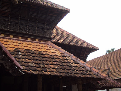
The roof forms are the most dominating element in the whole complex, which through their wonderful juxtaposition creates an impressive visual composition – an ever changing play of light, shadow & mass. The columns are mainly in wood & stone and support the wooden roof structure, which has been designed very creatively to be functional as well as aesthetic. There are strict rules & canons laid down in the ancient building science of Vastu Shastra, regarding the use of wood, techniques of joints, angles of roof forms etc, which have been religiously followed over the various periods during which the complex was built. The overall effect of this being that there exist cohesiveness throughout the structures, rendering them timeless.


The walls are usually made in laterite or brick & plastered over with lime. There are non-structural wooden screens called jaalis, which have the function of allowing in light & ventilation while ensuring the privacy of the person inside. The filtered light creates a dramatic play of light & shadow in the interiors and ensures a very cool & comfortable ambience inside, away from the blazing sun. The shaded interiors are cool, which is a direct derivative of the climatological need to counter the warm humid tropical climate. Indeed, one of the most significant aspects of the design is the sensitive handling of the light & shadows to create a wholesome comfortable ambience inside, one that focuses inside, calming, soothing & contemplating.
The flooring is unique and is black in colour, retaining a mirror like polish even now after so many centuries. It is said that the flooring was done using a mixture of different structures like burnt coconut shells, egg whites, plant juices etc.


Indeed, the Padmanabhapuram palace, with its amazing vocabulary of sloped tiled roofs, intricate jaali works, mysterious corridors, intimate courtyards, amazing woodwork, play of light and shadow, comfortable interior spaces etc, is a timeless architectural marvel and is a stark reminder to us of our rich tradition of innovativeness, respect to nature and search for perfection. The graceful simplicity of the complex stands as a dignified beacon, a reminder of what we should strive for in these times of mindless architectural gimmicks.
All images courtesy - Rajdatta Dewang


All Plans, Sections & Elevations courtesy - MIMAR - 'An Indian Portfolio - Padmanabhapuram palace' - by Raj Rewal, K.T.Ravindran & the Architectural Research Cell